scriptygoddess
29 May, 2007
(in search of) A better glass button photoshop tutorial
Posted by: Jennifer In: Bookmarks|Photoshop Tutorial
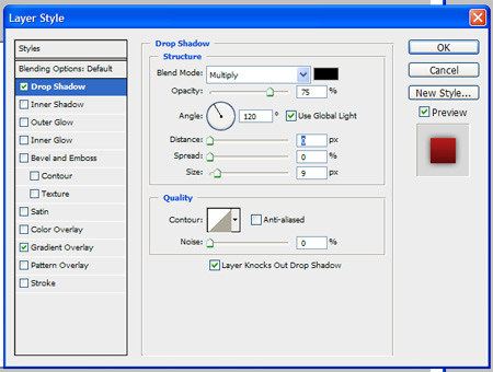
I've been hunting around the last few days, looking for a good tutorial on how to make those glossy/glass-like buttons in photoshop. There are A LOT of tutorials out there. Some of them are just hard to follow. Others only seem to work best with one particular shape. But I did find this one that worked for me no matter what shape I'm using. As well, it's incredibly simple and easy to follow. The one thing I added which I think helps the effect came from another tutorial I had seen – which was to add a drop shadow – about 75% opacity, 0 distance, and size: 7px.
(The tutorial is somewhat old (in internet years) – dated 2001 in the footer… Makes me wonder if the site is and will be still visible for too much longer…)
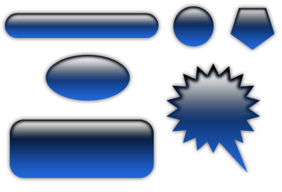
There was another one I found that was a little "fancier". (Side note: I went through so many of these pages today, and now I can't find the link to the one I'm thinking of. If someone recognizes these steps please make a note in the comments, and I'll update the post with the appropriate credit link. I've even gone through every page in my history. I suspect that I've combined a number of tricks from a variety of different tutorials to come up with this one, but with all the sites I saw, I can't be 100% sure.) I liked this trick – but it didn't work as well with every shape I tried with it. So click the "read more" to see how to create buttons that look like this:

(Updated 6/2/07 A lot of this is similar to these two tutorials on Bartelme – which I actually DON'T remember seeing before writing this – but I was looking at his badges trying to figure out how he did them, when I wrote this. I hadn't seen that he had a tutorial on them.)
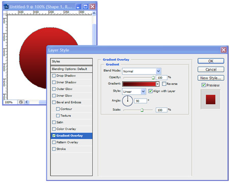
First you make a shape – and apply a gradient overlay – a color of your choosing to black. (with the black on the bottom).
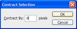
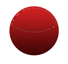
Then select the shape by holding the control key down and right-clicking on the shape layer. Then "contract" the selection. (Select -> Modify -> Contract). How much you want to contract it by will depend on how big your shape is. In the example I used for this tutorial, my shape was huge – so I contracted the selection by 6 pixels. For a normal, relatively small button, probably contracting it by 3 pixels is enough.
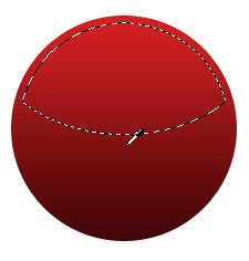
What we're trying to do, is get a portion of this selection – just the top half, with a curve in the middle… so I use the round selection tool and hold down the alt and shift key, while right-clicking to make an oval around the top half. This will result in selecting the overlap of the original selection and the new oval.
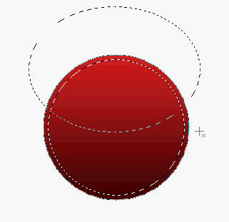
So this is what we end up with:
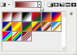
Create a new layer. What we're going to be doing is creating a gradient starting from just below the bottom of our new selection to just above it. However, I want the color to be about the same as what the color is at the bottom of that selection, so I use the "eyedropper" tool to grab that color.
The gradient will be using this color – to white – with the white at the top.
So, again, we're starting the gradient just below our selection, to just above… this may take some playing around with, but we want that "curve" in the middle to be somewhat subtle.
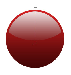
And the last step is to add that drop shadow to our shape layer to help the effect.
And this is the final result:
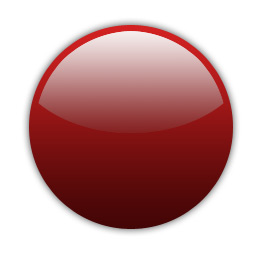
Of course my example is HUGE – but it works equally as well (if not more so) when it's smaller
But as I said originally – while I liked this tutorial as one of the better ones – for some reason, it didn't look as good on some of the "odd shapes" I tried it with – not bad – just not as convincing as the more symetrical, smoother shapes

Added after Another addition to this – I've seen a few buttons that also add a darker border around the button that also helps the effect. Also – when adding text or whatever on the "surface" of the button – if it's a dark colored button, making the text white, and reducing the opacity a bit so some of the button shading comes through, as well as adding a very light drop shadow (0 distance).